 too bad I can't chop up my painting!
Monday, October 31, 2011
Decisions, Decisions.

Here is my thrift shop painting! After a couple of hours searching through a creepy flea market I finally found this painting from the 70's for only TEN bucks. It also has a pretty cool frame but you can't really see it in the picture.
I have no idea what to do with this picture. I honestly thought about just buying another one so I wouldn't have to paint on this cause I'm afraid that I'll make it look even worse. Right now all I can think about adding is this  [the sun part] or some other warm colored planet. But I find that digustingly cheesy.
[the sun part] or some other warm colored planet. But I find that digustingly cheesy. First off, let me explain in pictures what this painting makes me think of.


My painting very strongly reminds me of East Asia and of the country Malaysia. The type of shack/house that is pictured above is called a "kampong". There are various types that people still live in today. I got to see a lot of these when I lived in Malaysia.
 The land based ones.....
I'm not sure if the artist was painting trying to represent another area besides Eastern Asia, but I thought it was weird that he painted a regular tree instead of a palm tree.
Anyways, I talked to my art teacher about stuff paint into my painting and he recommended that I brainstorm about things I am interested in or a cause that I could draw attention to. I will let keep this updated when I come up with something exciting!
U-G-L-Y
Have you ever strolled along in a flea market and saw a painting or picture that was extremely hideous that made you cringe? Well apparently, we learned that this kind of art is call Kitsch. What should and should not be accepted as art has been a hotly debated subject for millions and trillions of years and kitsch falls under one of those debatable categories. Some artists enjoy the tackiness and "out of the box" thinking while others think that artists needs to be abiding within certain principles of art.
On artist that I really liked learning about in class is named Wayne White. He takes old lanscape paintings you can find in thrift shops and incoporate text into it to send a message across. Here are some examples:


I really like the last painting alot because if you noticed in the other two paintings that the text is incorporated very well into the painting; in both other paintings there are shadows and reflections from the text painted into the painting. In the third painting "Fade Away" though, Wayne White created irony between what the text says and what the text does. The words Fade Away are not merged or "faded" into the landscape behind it-it visually pops out instead.
Another cool type of art that we talked about in class is called appropriation art. This type of art takes known/familiar objects and transforms it into art or uses found or natural objects in the same way.
One artist that I really liked was Jeff Koons!
Here are some pictures of his work. (the link takes you to the site I got the pictures from)


All those pictures are of stainless steel statues that Jeff Koons made that look like balloon animals. It would be awesome to see one of them in person!
Here is a different type of appropriation that Koons also did

I wonder how long it took him to make this puppy out of flowers....
One last picture that I really think is cool but I can't find the artist of it:

Appropriate looks really fun to make! When I was searching for things to blog about I found some other cool things. There was an artist that makes human skull sculptures out of different objects that ranged from candy sprinkles to diamonds. (Obviously, this artist did not fit the starving artist stereotype if he could afford to make a skull diamond. Just sayin)
On artist that I really liked learning about in class is named Wayne White. He takes old lanscape paintings you can find in thrift shops and incoporate text into it to send a message across. Here are some examples:
I really like the last painting alot because if you noticed in the other two paintings that the text is incorporated very well into the painting; in both other paintings there are shadows and reflections from the text painted into the painting. In the third painting "Fade Away" though, Wayne White created irony between what the text says and what the text does. The words Fade Away are not merged or "faded" into the landscape behind it-it visually pops out instead.
Another cool type of art that we talked about in class is called appropriation art. This type of art takes known/familiar objects and transforms it into art or uses found or natural objects in the same way.
One artist that I really liked was Jeff Koons!
Here are some pictures of his work. (the link takes you to the site I got the pictures from)
All those pictures are of stainless steel statues that Jeff Koons made that look like balloon animals. It would be awesome to see one of them in person!
Here is a different type of appropriation that Koons also did
I wonder how long it took him to make this puppy out of flowers....
One last picture that I really think is cool but I can't find the artist of it:
Appropriate looks really fun to make! When I was searching for things to blog about I found some other cool things. There was an artist that makes human skull sculptures out of different objects that ranged from candy sprinkles to diamonds. (Obviously, this artist did not fit the starving artist stereotype if he could afford to make a skull diamond. Just sayin)
Friday, October 28, 2011
Finale
So I have been a bit behind on my blogging, but I have been busy painting! I finally have pictures to show from my complete Stil Life project.
Here they are!
For this first painting we picked a group of produce to draw and paint. Our process was really interesting. First we painted each object the exact opposite color of what it really was and then proceeded to paint the real color on top. After that we were supposed to add the different colors/shades to make the objects look more real. When we were all done, we cut out tracing paper, sprayed adhesive glue on one side and created an interesting background for our still life composition. Before we created a background, it was just plain brown chipboard. I choose to not paint in the shadow on this composition because I thought that it would be too much to have on there. I really enjoy the bright blue in contrast to all the other colors in the composition. I feel like it is much more complete. Actually my background was a little bit accidental. I did not mix enough paint to cover my whole board and the roller I was using to apply the paint had just got washed so the top faded part where the blue is very light is a result of a lot of watered down paint...but I think it all works together really well.

This second painting had the same exact process except we were told to zoom in on the fruit and make it larger. I decided to make this background a little more complicated since my first one was so simple. One of my favorite things to see in other people's kitchen is colorful tiled walls so I created a visual simplification of what you would usually see. As you can see, I did not bother to make my "tiles" perfectly even.
One thing that I am waiting to fix on this is my shadow I painted in last. I want to fade it out a big more so that it does not stand out so crisply since everything else is much softer and rounded.

Hope you enjoyed looking at my work. I worked really hard and long on these and I am really happy with them!!!
Wednesday, October 5, 2011
Still Life and Skulls
Our current project in art is working on a still life painting of some pears, apples, and peppers. Part of our thinking process/inspiration research was to look up a list of famous still life artists online and check out their work. I was kind of creeped out by some of these artist's still life compositions.....it seemed like a lot of artists really enjoyed throwing in a human skull into their paintings. Not only that but they have to have the skull in there with a dark background which makes it that much more depressing. I don't know. Maybe it was a huge artist trend back in the day. If there's no skull then it's not cool?? One artist even painted a stack of human skulls! He must have been the trendsetter.
Here is the list of artists that we were recommended to check out. Feel free to check them out yourself and make your own opinions.
Jan Bruehel the Elder
Juan Sanchez Cotan
Jan de Heem
Jean baptiste simeon chardin
Paul Cezanne
Georgio Morandi
Wayne Thiebaud
William Harnett
Marsden Hartley
Pablo Picasso
Henri Matisse
For example, look at what Googling Jean Baptiste Simeon Chardin pulls up. It's kind of crazy that a lot of his still lifes involve some kind of butcher meat and a cat. I like the cat part actually. In fact I was really freaked out at first because I thought he painted a butchered cat. Anyways, I wonder how he painted the raw meat and how fast he was able to paint or if he kind of took his time and ignored the smell of it all. I wondered if he had any flies that were really in that picture like his cat supposedly was and he chose to not paint them in!
Here is an artist that really excited me though. His name is Wayne Thebauld and his still lifes are very different from everyone else's on this list. His work reminds me a lot of posters and of window shopping and delicious food.
Who needs skulls? They certainly aren't as tasty.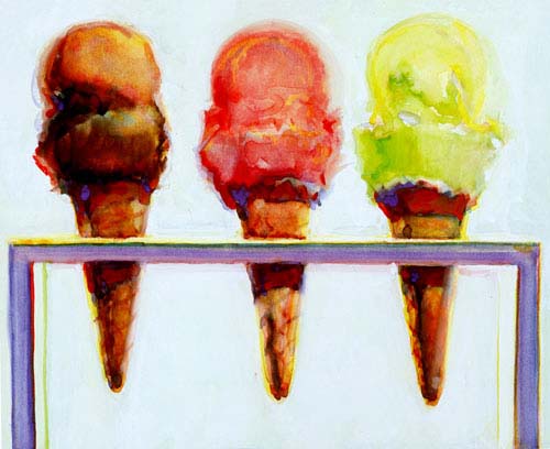 I scream for ice cream.
 lollipop lollipop oh lolly lolly lolly lollipop. *pop* ba dum dum dum
 I love this more than a fat guy loves cake. haha
ADORABLE!!
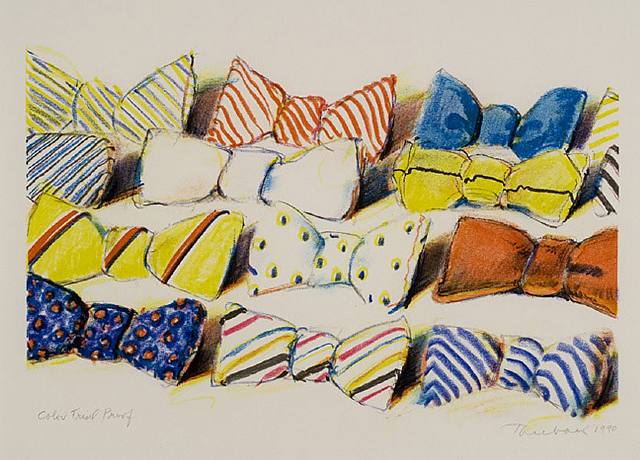
Here is another piece I liked from this list.
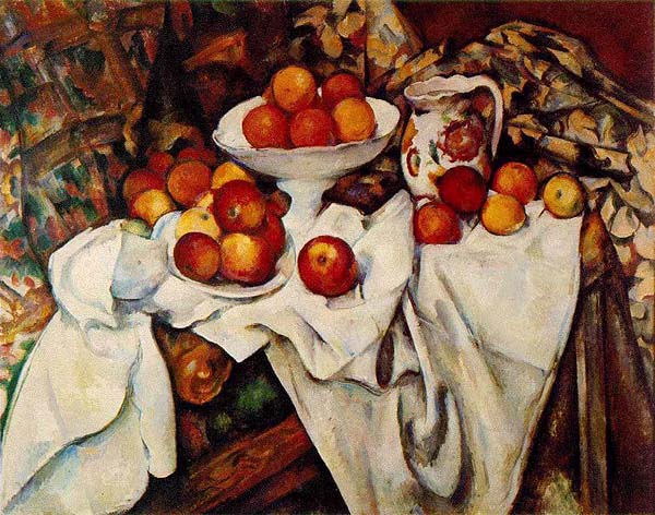
Peaceful composition huh? This is "Apples" by Paul Cezanne
Trip Review
So like I blogged last week, my class went on a field trip to a printing word press workshop for a day. It was pretty interesting seeing the machinery and some of the work that this guy did!
Here is a photo from the day. His whole work studio was in his garage and that is where all 20 of us were crammed into.....check out that photo.
I really like the angle that Mieko took this photo from because it also has some letter drawers out with some different fonts.
I learned some really new things about printing I had no idea you could do. I was dying to play with the ink colors and use the grain in wooden blocks for texture in my print but to save time, everyone in class used the same metallic red. Of all the colors it could have been, it was pretty cool!
Since we had so many people there and we got off to a slow start on setting letters correctly not everyone got to print their phrase.....I was one of them. I had my whole thing set but I ended up having to put everything back so we could leave. I took a picture to share on my blog of what I was going to print though.

What do you think? I definitely didn't think it would look as cool as I imagined., I wouldn't have minded if I got to take all the letters home with me. I love wood and all the wood letters I saw were super cool.
Anyways, cool field trip and interesting stuff. I just wish that the process and timing would've been a little bit better so I could've came back with a neat souvenir like everyone else!
Subscribe to:
Posts (Atom)