Tomorrow my class is taking a field trip to an ink press where we will get to participate in a hands on project.
We were told to pick a fifteen or less word phrase that is relevant to us. Then I think we get to design a print and print it there using the special equipment. We were told to look up Amos Kennedy and his printed works in which he does a lot of protest art....or at least that's what I call it.
I picked the phrase "That's not my name" to print because I feel that sometimes people see me as someone who is just this or just that when really that is just one small part of my whole person. For example, some people call me "asian." although I am Chinese, I hate hate hate being called that as if that was my real name because it's really not.
So we'll see how it goes. I am excited though!!!!!
Wednesday, September 28, 2011
Thursday, September 22, 2011
Struck
I found art in the most surprising way the other day! I was sitting in my psychology Human Growth and Development class and we were talking about motor skills in children. Dr. Yonts showed us lots of examples of children's drawings and how they change and develop as they gain control of their muscles.
I love kids. They are so adorable and innocent and I especially love looking at what they draw! It's so precious.
So here are some photos I scrounged up online of drawings kids did that I think are adorable. Not to mention inspiring in their own little way.
 Yeah, I love my mom too. :]
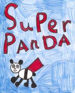 That's right Superman. See this and weep...Super Panda is coming to save the world!
 Pretty sure that this drawing correlates to the book series Rainbow fish. That was one awesome fish.
 This crab reminds me of the crab off of The Little Mermaid.

Is this a chipmunk or and owl? Who knows! It's freakin adorable.
Hooray for little kids!
Too bad I can't get away with this kind of art in my art class :O
I love kids. They are so adorable and innocent and I especially love looking at what they draw! It's so precious.
So here are some photos I scrounged up online of drawings kids did that I think are adorable. Not to mention inspiring in their own little way.
Yeah, I love my mom too. :] That's right Superman. See this and weep...Super Panda is coming to save the world! Pretty sure that this drawing correlates to the book series Rainbow fish. That was one awesome fish. This crab reminds me of the crab off of The Little Mermaid.Is this a chipmunk or and owl? Who knows! It's freakin adorable.
Hooray for little kids!
Too bad I can't get away with this kind of art in my art class :O
Not Lost but Found
I just found a neato artist blog that had this whole new thing about reusing old paint cans for art.
Check it out!!!
Some of my favorite ones on there are the cans-regular and spray cans that are turned into light shades!
Apparently, this blogger is a mom, business woman, interior designer ish person, and super crafty.
She would totally be a cool person to check out for Christmas....because everyone knows that's coming around the corner. ;)
I can see clearly now....
I took the FM 100 Hue Test to see how color blind I was.
I'm not sure what the scale is for scoring but the lower the score the better! I got a 4. So, not too shabby, but not perfect. It also said that I have low color discrimination in the purple/lavender section of the scale.
At least I know I am in the "artist range" [20 and below] though.
I tried to get my results here as a screen shot but failed miserably.
Here is a link to a test that is very typical. You should take this one first and see how you do!
And here is a link to the test that I just took if you want to take it too!
Enjoy and good luck. :))
I can't believe we get to paint in painting class!!

So right now we are working on color theory charts! It's long and tedious, but I am just thrilled that we finally FINALLY get to use our paints!

Color theory charts are basically taking two colors and mixing them together to get specific and different combinations, tints, and shades.
We have fifteen color sheets to do this week and we are using six different colors. I will be using ultramarine blue, naphtol red light, orange, yellow, napthol green, and magenta! I will snap pictures when I'm done with all fifteen. :)
Rewarding Results?
Well, here is how our project really turned out:
Going from our clean landscape and leaving a trace instead of leaving no trace idea, we decided to have a trash bag with trash around it instead of filling the bag. We represent the imagery of our clean landscapes with bright colors inside our trash bag underneath the spilled oil and we made our lightbulb bush-which was one of the best parts.
Originally, I wanted to smash each can flat and layer them so that our project would be made on a board of cans, but everyone else thought that it would look better and be easier to make if we used a cardboard box sort of like a frame.
This is an aerial view.

Looking back on this project, I could see why it was not as strong as it could have been. Seeing it from a photographic perspective rather than an interactive one makes a huge difference. Now I realize that it is way way too busy!
I think if I were to do it again, I would maybe try again with smashed cans and coordinate the colors or something and have the same centerpiece.

Although our project turned out how we wanted it to, I think it could have been a lot better had we had more time to work on it. But no matter what, I'm happy I got to know Frances and Jordan a bit better while we were working on it. It was/they were a lot of fun! :)
Landscape Project
So I am behind on my blogging.....I am sick and bedridden so I thought now would be a good time to have a blogging binge. We had a group landscape project assigned last week that was supposed to capture the concept of a landscape without being too literal. My group kind of had a rough time coming up with an idea because we couldn't find a time when all of us could be together at the same time. However, we eventually decided to do kind of a trash art as an anti-statement/thesis for the outdoor friendly slogan "leave no trace".
Here are some of the things that we liked and included in our project:
 we really liked this because it was a really strong yet simple piece.
and we wanted to include colors from landscapes that we admired for their cleanliness.

 Soo how do you think our project turned out?
Here are some of the things that we liked and included in our project:
we really liked this because it was a really strong yet simple piece.and we wanted to include colors from landscapes that we admired for their cleanliness.


Saturday, September 17, 2011
Follow That Ink Trail!
Here are my ink landscapes that I painted for class. They are all very different from each other but I like aspects from each of them.
This painting was the very first one I did. I worked on it in class and it was very experimental to me. I was surprised to find that this painting was the one that most people in my class enjoyed. And after viewing it from a farther perspective, I have to agreed that the composition is more interesting than I thought. I originally did not like it because I didn't feel like it all fit together; all the strokes are different across the painting. But I guess different can be good sometimes! :)
 This second painting I was more deliberate in picking and choosing my ink strokes. I tried to simplify what I was seeing in the picture and just capture the general idea. I like how I did the tree trunks but I wish that I could have done a better job with the foliage.
 This painting is obviously very abstract. Like I talked about in my last post, I intentionally painted it this way. Although it IS very simplistic and "easy" I really liked working on it. And as silly as it may seem, I had a fun time coming up with the concept of it.


Looking back, it's funny to see that my paintings seemed to get less skilled the more I thought about things. Maybe I will use my brain less the next time around. Haha
Saturday, September 3, 2011
Oh glorious Bville!
This week we have been painting landscapes using ink and pictures we took of scenes around B-ville.
Here are some pictures that I snapped for this project:
 Although this picture is my favorite, I have had a hard time putting it together in ink. There is a lot of detail and texture that I want to capture and I have yet to find a technique that I like that I think will do this shot justice. :/


Here are some pictures that I snapped for this project:


These two pictures are pretty fun. I like how the picture makes sense even when it is flipped upside down. Can you tell which is the really picture? I think for this landscape I want to fold my paper in half and paint it vertically/move things around a bit and see what I get when it's done!

Subscribe to:
Posts (Atom)